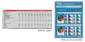
I’ve never been a numbers person. I know folks who are, and I respect and admire them. I groan at the thought of dealing with taxes (I know I’m not alone here) and I still have nightmares about being in high school math class. Luckily, Rasor is the perfect mixture of right-brained and left-brained gurus, so by the time numbers are sent to me, they’re organized and ready to be beautified. We’re experts at taking scary Excel sheets and turning them into lovely graphics, charts and reports that are easy to read. Some people might deem this unnecessary…and those people are wrong! Or at least they don’t know the power of data visualization. Here are some of the many benefits of sprucing up your data:
1) It helps you.
Picture this: you’re in a meeting with some important decision makers in your company. Someone asks you how revenue looked in Q2, and you scramble to search through your stack of reports, all of which look the exact same. It’s 2017, people! We have the technology for at-a-glance reports that won’t leave you looking disorganized in a meeting. Getting your data organized helps you communicate and helps with decision making.
2) It’s communicates more effectively to your audience.
Humans are visually wired, and we’ve become more dependent on visuals due to the information overload we experience every day (thanks, Internet). If you want someone to notice your message, visuals can increase your audience’s willingness to read by 80 percent.
3) It just looks better.
As a designer, this is reason enough. Do you know how much better filling out your taxes would be if the forms actually looked fun?? I want an adult coloring book, but for insurance paperwork and tax forms. Even if you’re a numbers person by nature, there’s no debate that breaking up and beautifying your data makes it easier to read, and in turn, easier for everyone to understand.
If any of my points made you think, “huh, I need something like that in my life”, you’ve come to the right place. We have tons of experience translating data into reports that people actually enjoy looking at! And if you’re in the healthcare biz, there’s an app for that! Literally, we made an app for exactly this reason, and it’s awesome. Looking for more reasons to believe? Check out these stats (which are organized into an infographic, of course).