Here’s one of my favorite bits of design trivia: which brand’s famous logo only cost $35? Since 1971, Carolyn Davidson’s swoosh has grown to be one of the most recognizable brands in history. Nike’s logo epitomizes the elusiveness of logo design; some companies spend thousands of dollars on building their brand, and sometimes you nail it the first time with a visual identity that costs less than an oil change.
Logo design isn’t an exact science, but as a team of marketing and communications experts, we highly suggest building your brand on a strong foundation. Here are some of our tips for crafting a thoughtful, meaningful and effective brand.
Start your brand with your messaging
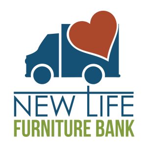
If you start creating a visual identity before your identity is solidified, you’re asking for a crisis later down the road. Sitting down and hammering out who you are as a company can majorly influence the development of your brand. Our team typically sits down with clients and builds their key messages before we ever go into design. To give New Life Furniture a new logo, we started with defining their core values and developing their key messages before diving into designing a logo.
Value thorough research
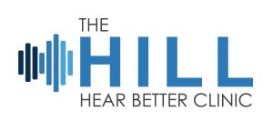
Building a brand before conducting visual research is like trying to navigate an unfamiliar city without a map; you might have some fun for a while, but eventually you will get lost in a sketchy part of town with no cell phone service (I’m speaking from personal experience). Gathering information on what already exists can help you differentiate your clients from competitors, inspire you towards a certain direction or give you some solid ideas on what not to do. As we laid the foundation for Hill Hear Better’s new logo, we researched anything and everything connected to audiology, which helped us better understand visual representations of their industry.
Don’t rush into things
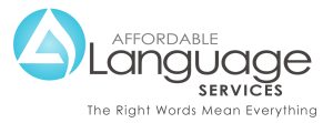
Rome wasn’t built in a day and great logos aren’t built in a week. Rushing to just get any visual identity out the door will most likely result with a logo that no one is thrilled about, and cutting corners is ultimately only going to harm your brand. Put a generous chunk of thought into your logo. Don’t just make it blue because blue is your favorite color. Your visual identity carries a huge weight in symbolizing your company; treat it as such and give it some love. When working on Affordable Language Service’s brand update, our team dove into additional cultural and color research to be thorough in building their brand.
Logo design isn’t an exact science, but following a consistent process for building a brand can make your life way easier and your end result much more effective. Need help amidst a rebranding project, or struggling with building a new logo? Talk to us!