
By Brandon Losacker
A couple of things should be considered when making a great presentation: a good script (naturally) and good design. Most of us typically focus on the script as the priority – and for good reason – but nothing can kill your credibility quicker than bad presentation design, regardless of how awesome your copy is.
Look at it like this: If your doctor is wearing neon green track pants and a coffee-stained Ed Hardy t-shirt, you may have a hard time taking anything he says seriously.
Whether you use Rasor as an option for design services or not, you can still benefit from a few pointers that will help you dress up any presentation like it means business.
Tip #1: Define your colors
If you’re using color, try to be consistent. Bright, gradient designs with many colors can look at bit tacky and all over the place. Limit your colors and stick to the same ones throughout. Borrow from your logo. Use one or two main colors in addition to black and white. Use one color for background and an accent or “spot” color to draw attention to calls to action.

Tip #2: Be consistent
With so many variables included in your presentation, it’s important that they all look like they came from the same source. Try to use the same font and colors throughout, and make sure the imagery has a cohesive look and feel. Slides can look disconnected if one image is sleek black and white and the next one looks like a kaleidoscope.
Tip #3: Format your text
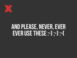
It may seem small, but formatting your text can make your presentation appear more professional. Three things to avoid are: orphans (when you have a long line of copy with a very short line or last word underneath); lines that go end-to-end on your frame, and emoticons (even though I’m not 12 years old anymore, I am guilty of using emoticons/emojis in text messages).
Just try to keep the lines roughly the same length ;-)


Tip #4: Pick background images for legibility
If the background does not have enough contrast it will be hard to read. Flat colors or images with even tones work best and can be read easily. If you are interested in learning more about color theory, check this out.


Tip #5: Drop anything that is not vital
Look, I get it. You’ve researched your topic for months and have 100 pages of documentation to prove it. Here’s the problem: people can’t take in that much complicated information at once. Try to present one idea per slide/scene. Seth Godin recommends no more than six words on a slide. EVER. Sometimes that might mean breaking up your dozen or so dot points into 2 separate slides. You can do it. Be savage.
If you are going to close your presentation with “Questions?”, consider ending with a strong image displayed that relates to your presentation’s content. According to Wirebuzz, people retain around 95% of a message they saw in a video, but only around 10% if they read it in text.

That’s it. Boom. Drop the mic. Walk away.
Need help with your next presentation? We’re just a click away!